Truwell
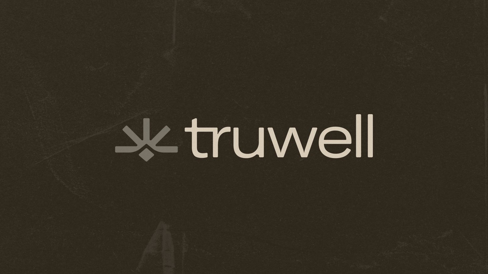
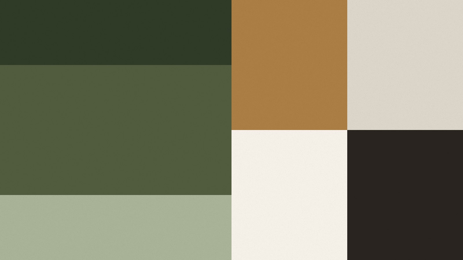
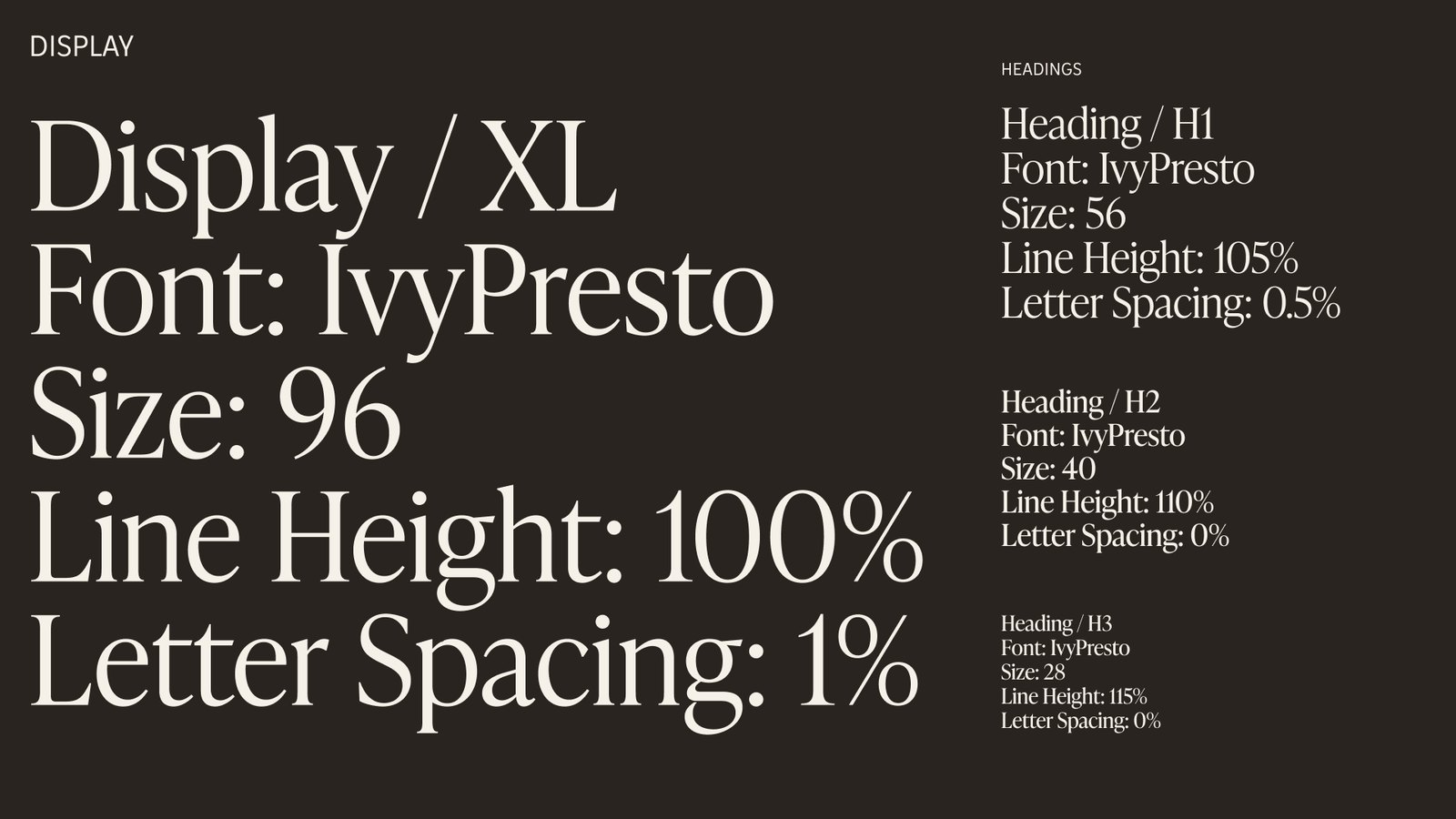
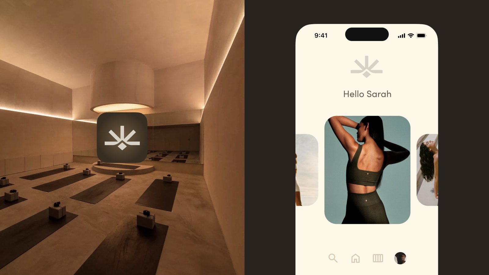
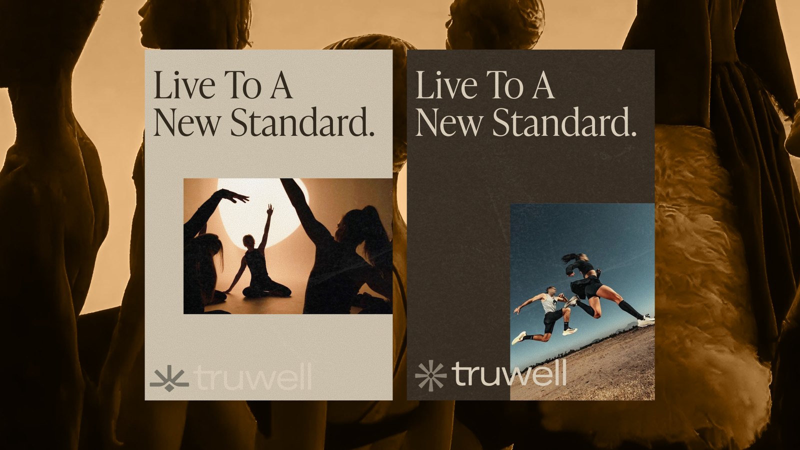
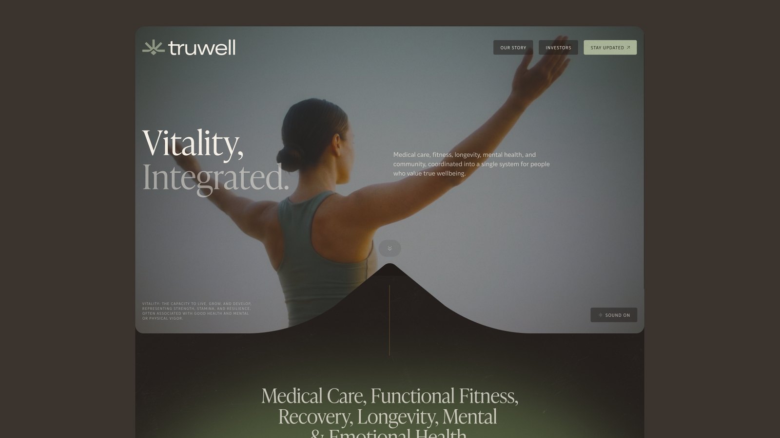
Truwell is a new take on wellness built around real, physical places. Somewhere you can drop in throughout the day for community, movement, and a calmer way of living. We gave it a warm, grounded look: a serif led identity, earthy colors, and a system that feels less like a gym and more like somewhere you actually want to spend time.
Kinala
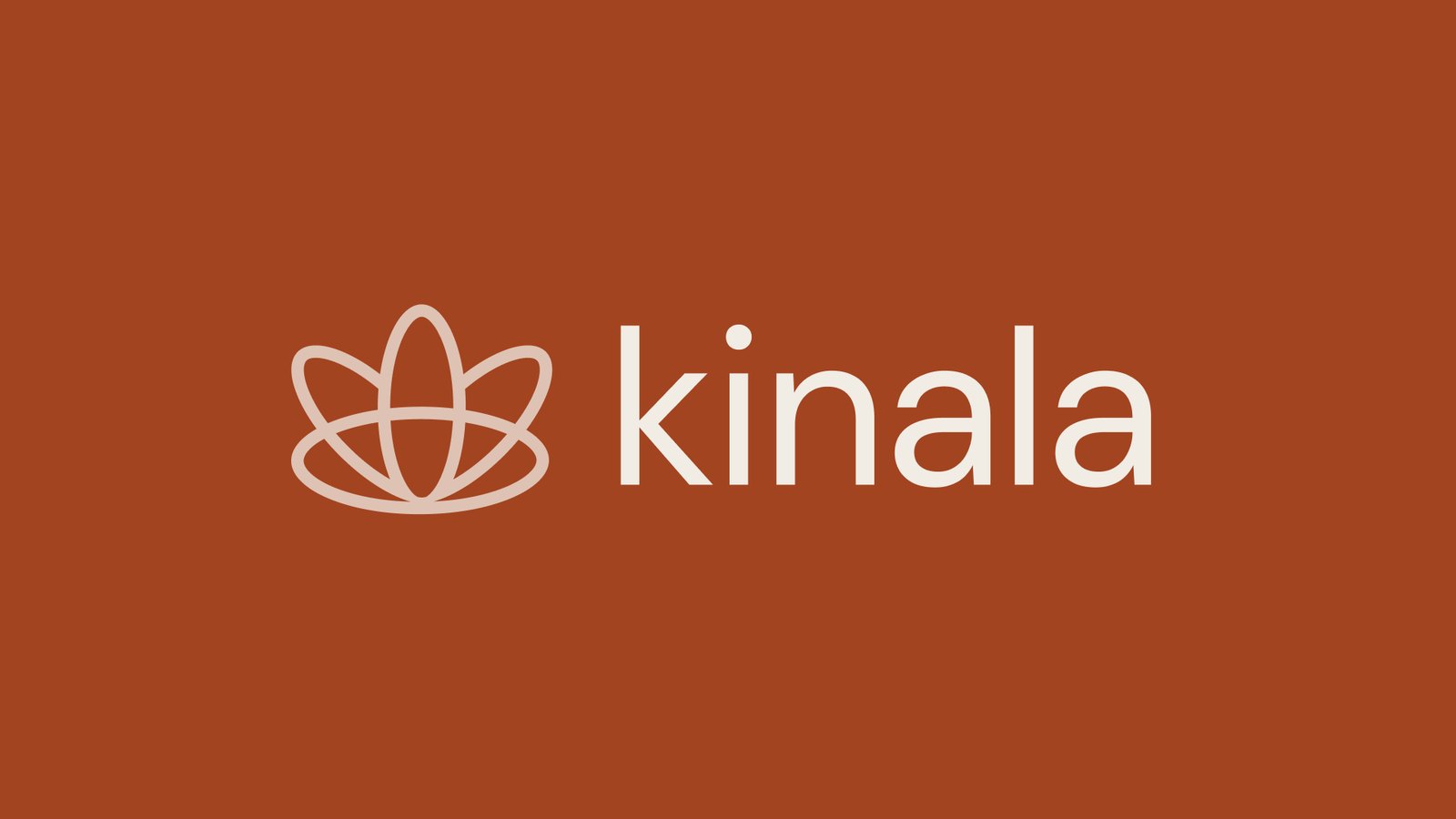
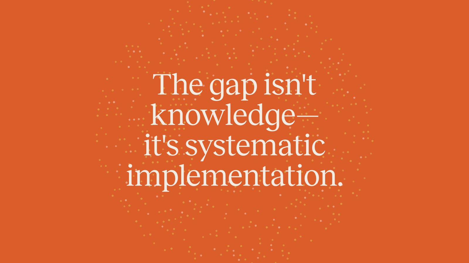
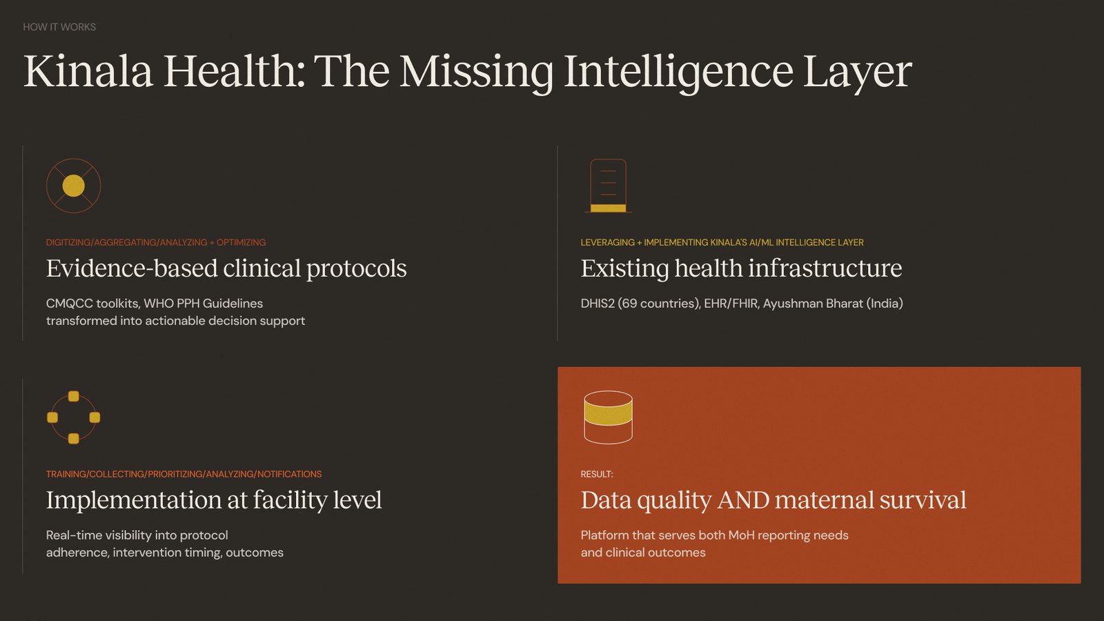
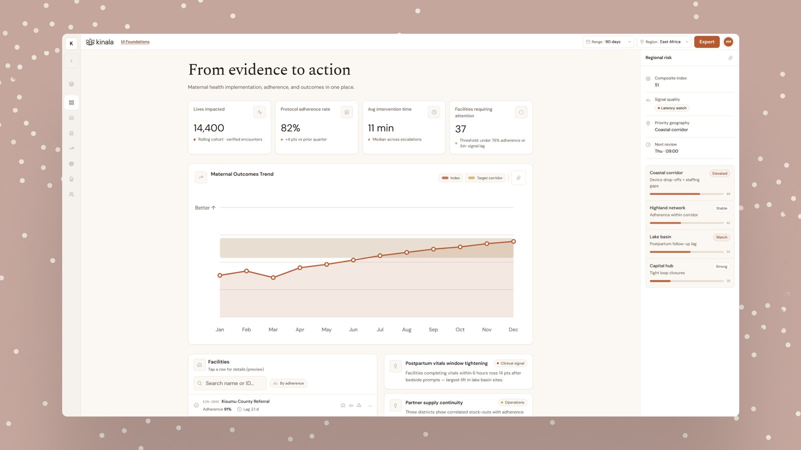
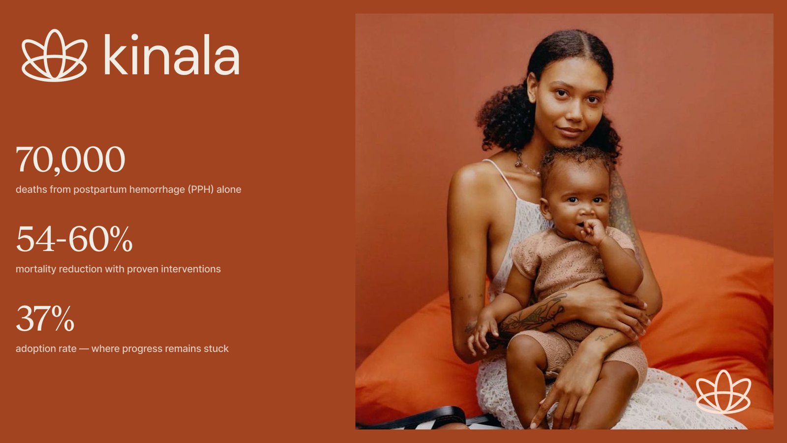
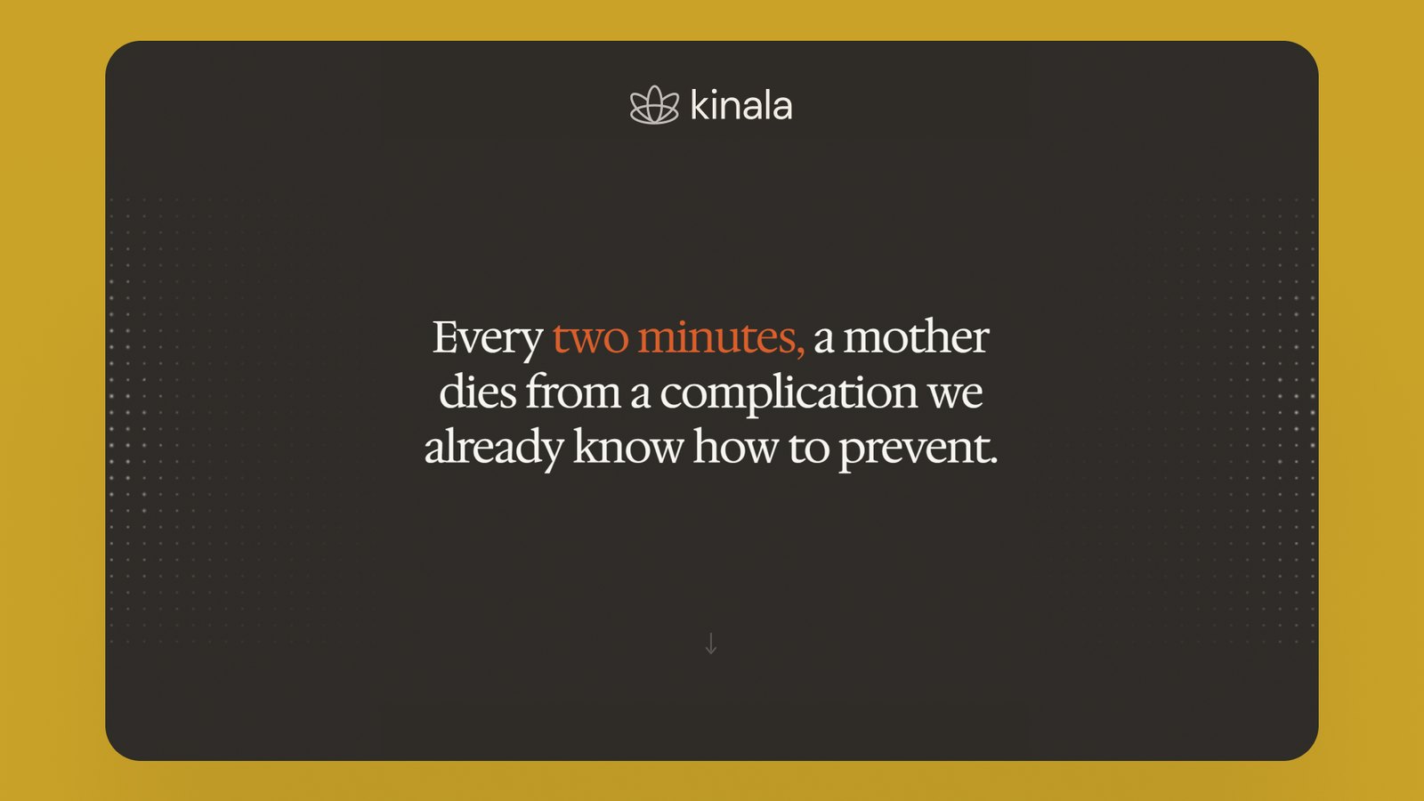
Kinala helps medical facilities in underserved parts of the world work with the same clinical protocols the best hospitals use. It also looks back at where things went wrong, so problems can be caught earlier next time. We built a brand that feels credible but still human: warm terracotta and cream, a lotus mark, and a system that reads like care rather than paperwork.

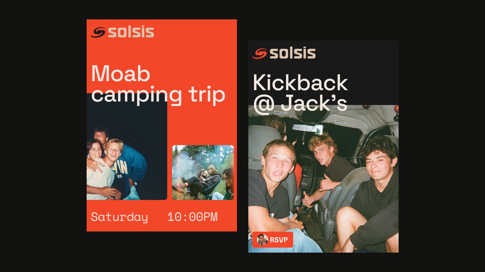
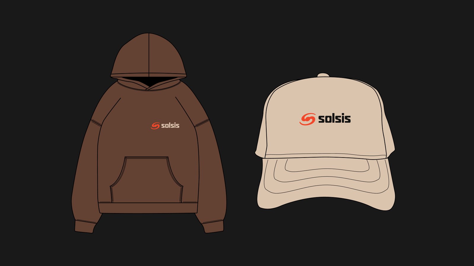
Solsis
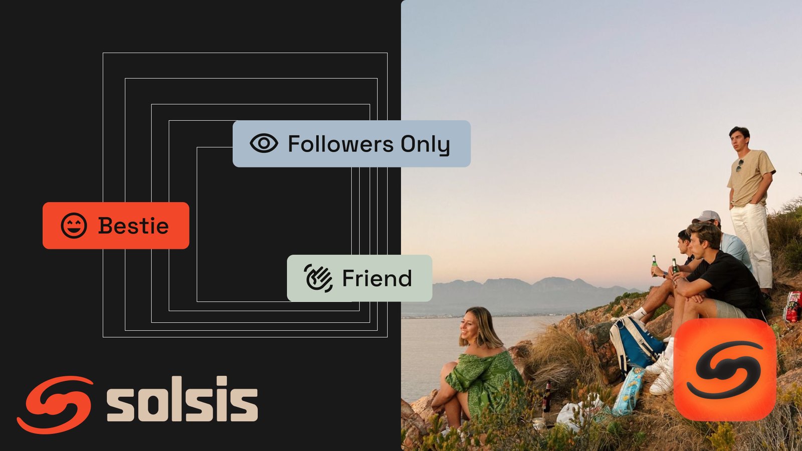
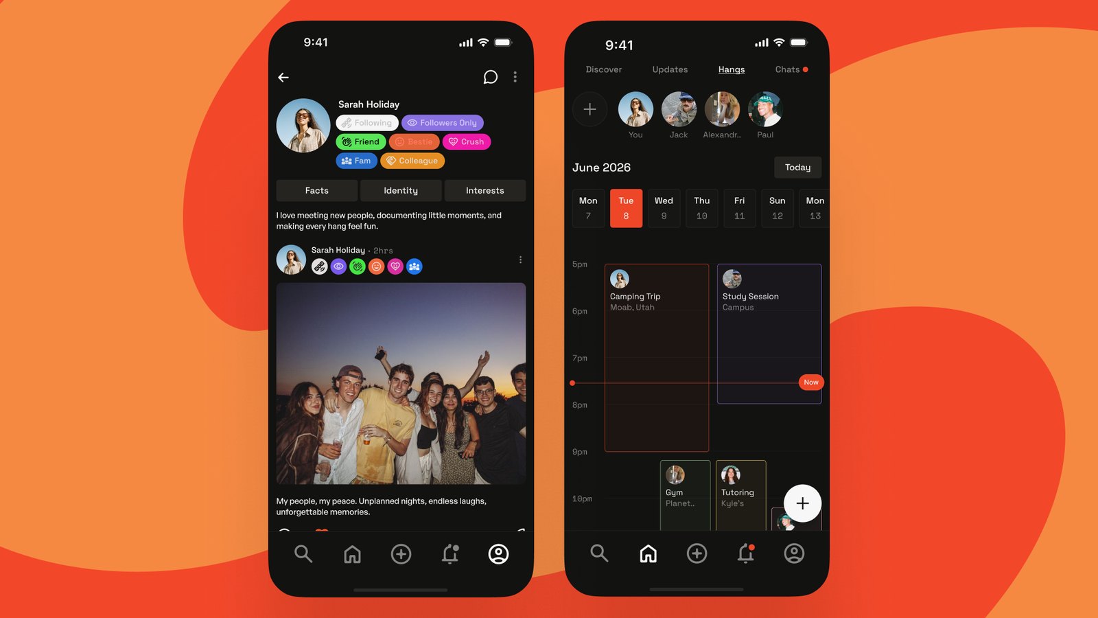
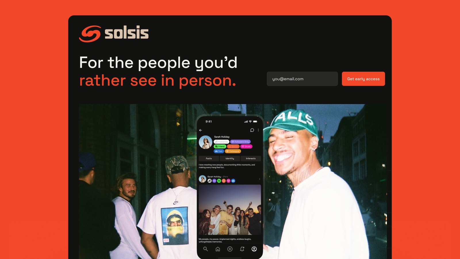
Solsis is a social app built to get people offline and into the same room, with friends and strangers alike. The brand has a bit of street energy to it: bold, a little loud, and made to live out in the world. On screens, on posters, and on the back of a hoodie.

How the two weeks goes.
No drawn out timelines, no hundred page strategy decks. Three phases, one focused stretch of work, and a brand you can start using right away.
Dig
We spend the first few days getting to know you. What you do, who it's for, and what actually sets you apart from everyone else in the room. Everything after this builds on what we find here.
Build
This is where it comes together. Logo, type, color, and the system that holds it all, put to work across the things you'll actually use: your product, your site, your social.
Ship
We wrap it all up. Final files, a simple set of guidelines, and every asset ready to go, so you can show up looking like yourself from day one.